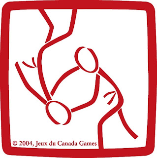
I first saw a martial arts pictogram used at a dojo I trained in England. I instantly fell in love. It is simple, primitive art with clean lines - just like good judo. This week I decided to search out the judo pictographs, and much to my dismay they is no collection of them on any internet sites that I could find. So I clicked and pasted small images and tried to fix them on photoshop. There is likely some distortion on a few of them. This blog entry was quite a labor. Enjoy it Judoka!
— noun
another word for pictograph
pic·to·graph
–noun
1. a pictorial sign or symbol.
2. a record consisting of pictorial symbols, as a prehistoric cave drawing or a graph or chart with symbolic figures representing a certain number of people, cars, factories, etc.
So the Olympics has had a history of graphic design making primitive pictograms for many of the sports. I it used for a variety of functions, but basically it is a cool design that cuts through language barriers.

For the part the trend to make pictograms for the games started in the Tokyo games of 1964. Here we see a judoka standing proudly.

The art genre has been heavily influenced by the designers of the 1972 Munich games. I like this one.


 alt=""id="BLOGGER_PHOTO_ID_5572972714209620018" />


Cool post. I think my favorite of these is third up from the bottom - the small, red, angular taiotoshi
ReplyDeletefourth up seoi nage
Deletei like the one above that one....
ReplyDeleteI like Athens 2004.
ReplyDelete